A Birmingham charity walking alongside people in recovery from addiction, mental‑health challenges, and trauma — through guided hikes, fresh air, and community.
{/* image + floating card */} {/* trust strip */} {t}
{t}
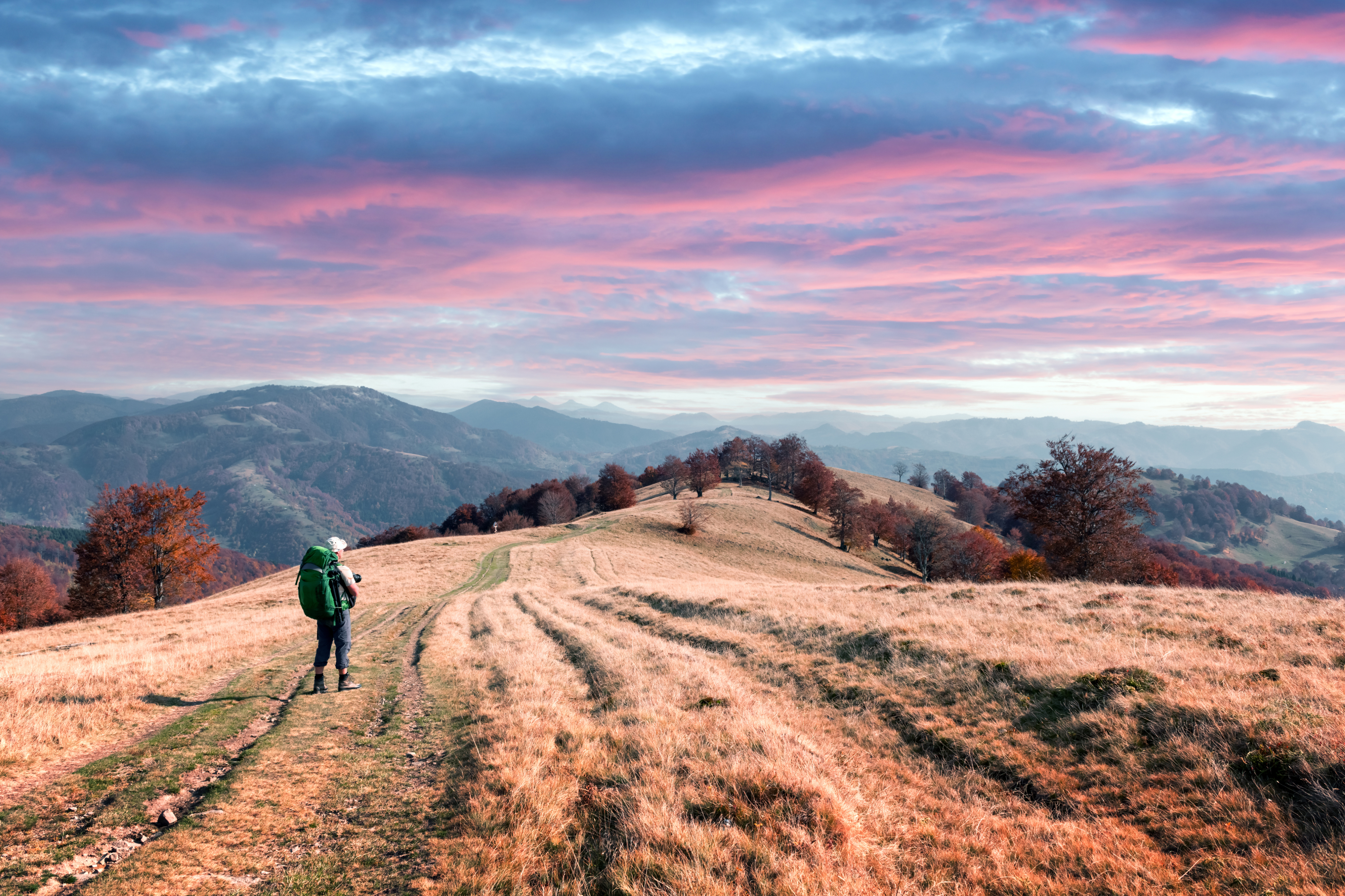
Hike2Heal began on a muddy footpath outside Birmingham — a handful of people in recovery, finding it easier to talk shoulder‑to‑shoulder.
Today we're 1,200+ walkers, hosting guided hikes across the Midlands for anyone navigating addiction, mental‑health challenges, or trauma.
{/* photo collage */}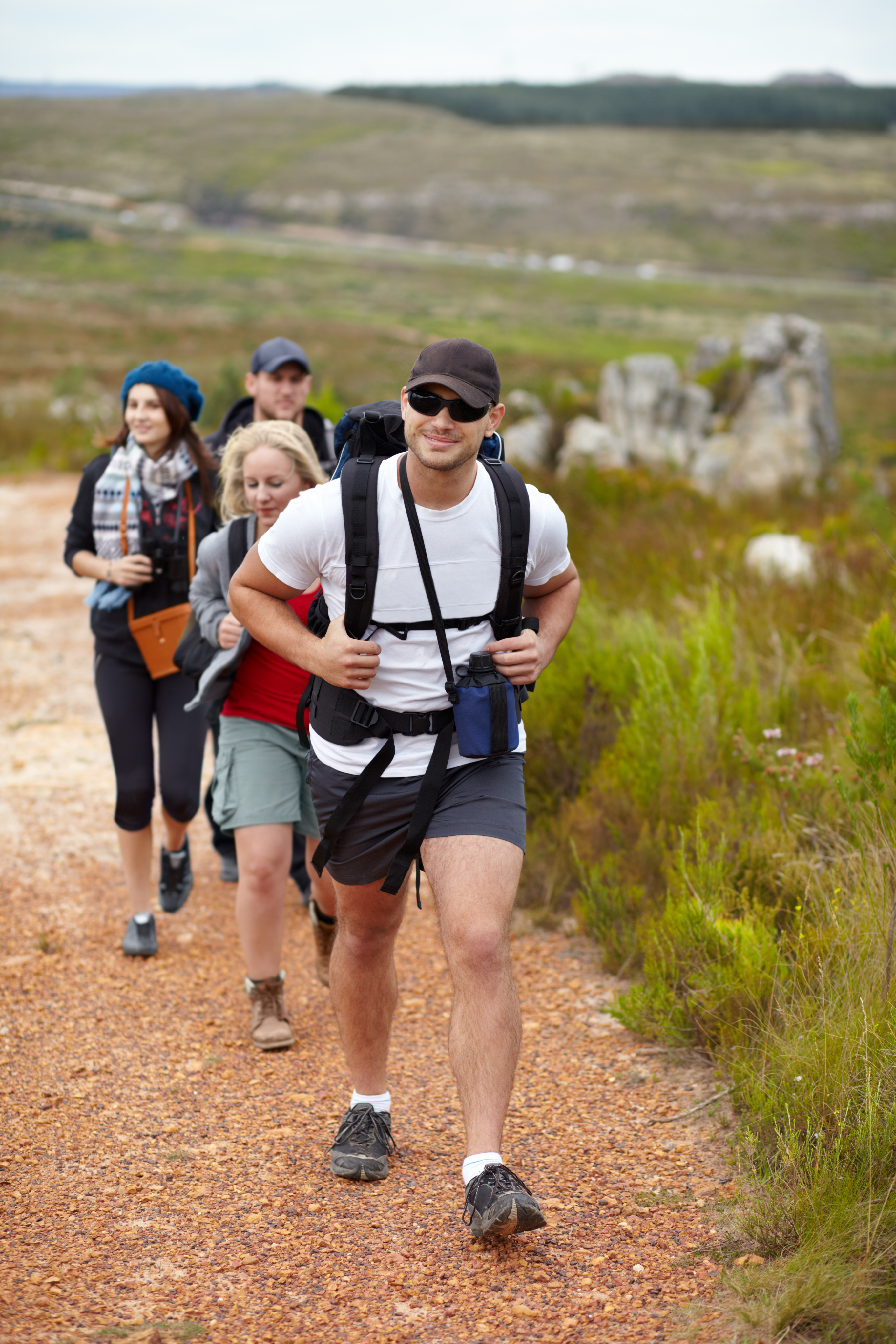
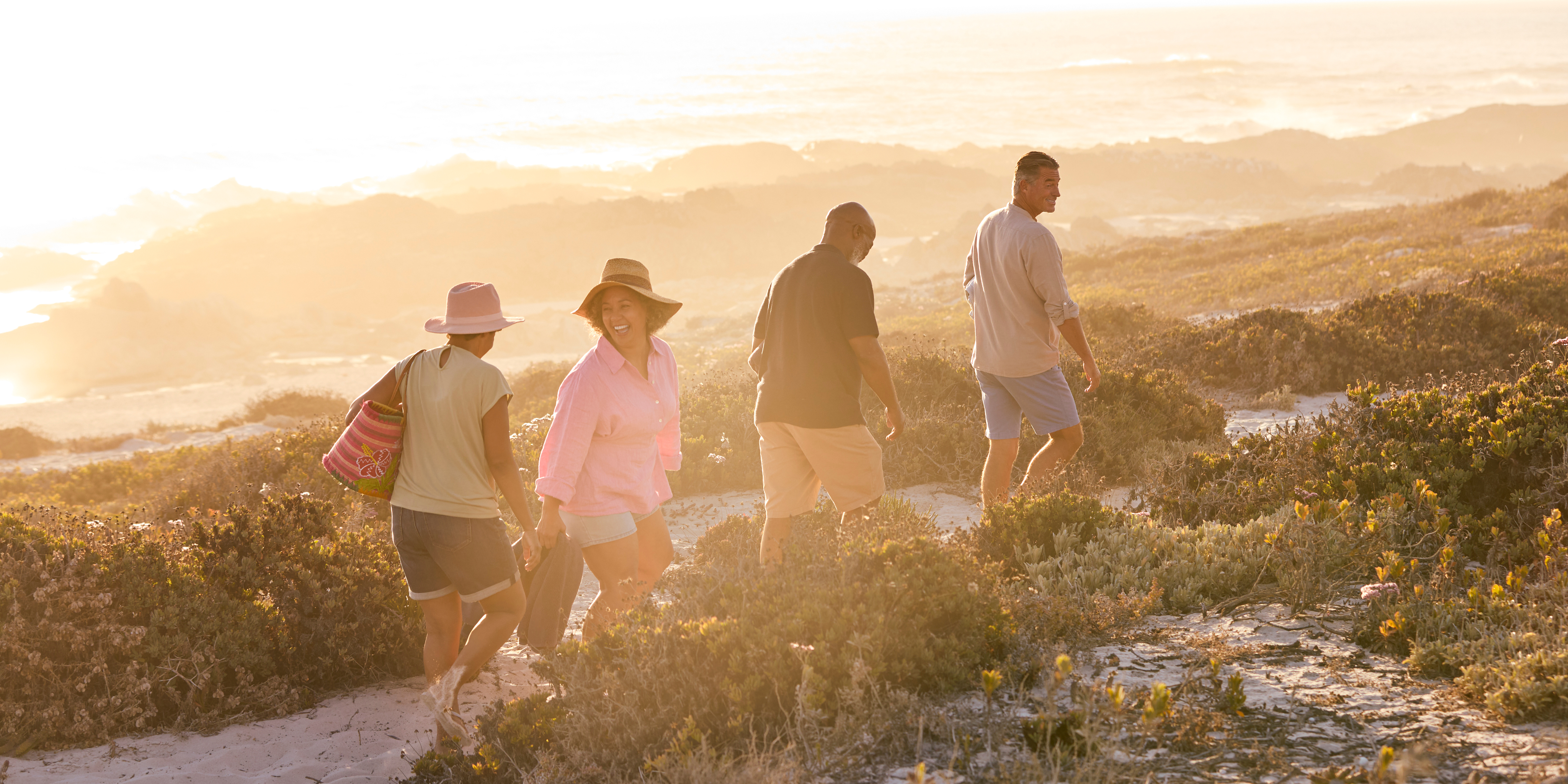
Recovery isn't a journey to walk alone — every step is stronger taken together.
Every hike is a chance to connect, heal, and grow — whether you're in recovery yourself or walking in support of others.
{/* feature photo card */}
people have already hiked with us — and the trail is just getting started.
See upcoming eventsReal walks, real people, no filters.
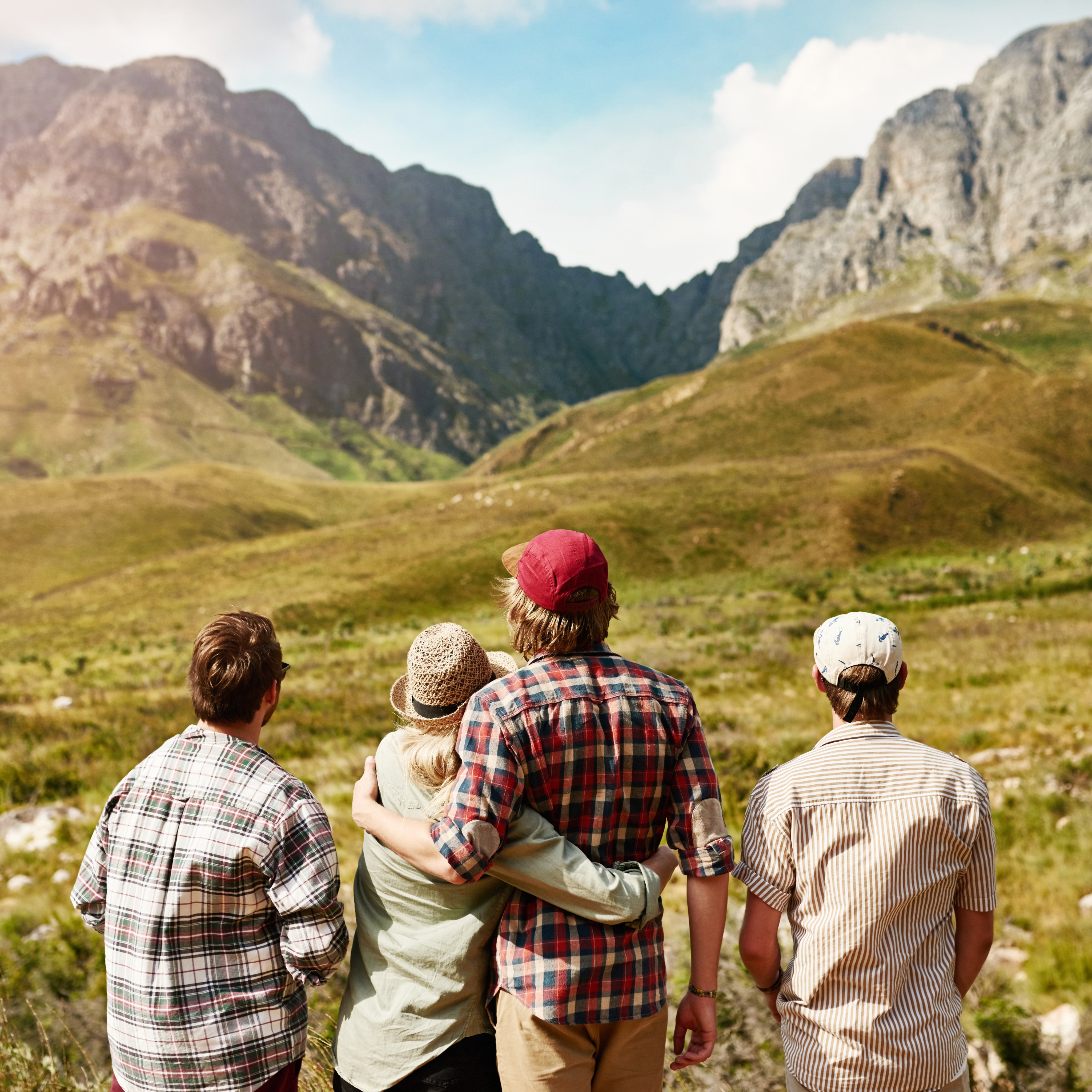
“I was terrified turning up alone. The team made me feel safe from the first step. I left lighter than I arrived.”
Upcoming hikes, stories, and ways to take part. Unsubscribe with one click.